LES Blog improvments - vent your feelings
The change to a WordPress-based blog yesterday was noticed by many and as always when there is change, some hate it and some accept it.
Making the change yesterday was not to show a finished product, its intention was to get the ball rolling and making adjustments as we go along.
One thing that I was taught in my early days was that if you keep tinkering with details, you will never release anything. Because there will always be things to adjust, fine-tune, "make a little better".
Sometimes, and this was one of these times, it's better to push it out in the open, watch the reactions and act upon the constructive feedback that is given.
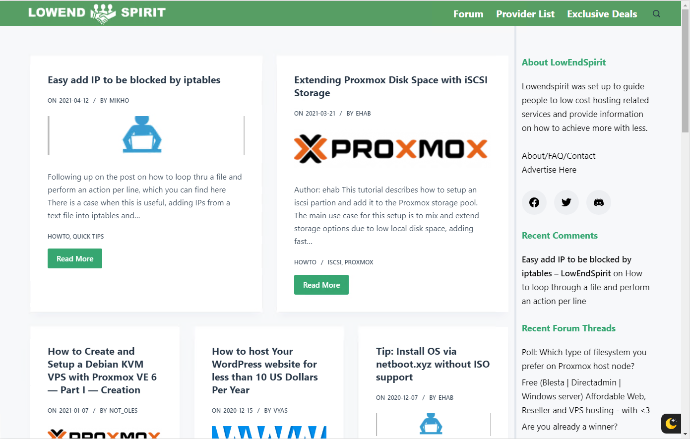
we can all see the current state of the blog by visiting https://lowendspirit.com
The first version was created with the intention to cover some, maybe most of the "must-have" features.
- Using the same green color as the forum
- Easy readability (thank you @Not_Oles for your comments)
- Possibility to display all authors on a post
- Including the old Grav posts
- And some other things that I can't remember at the time of writing this post.
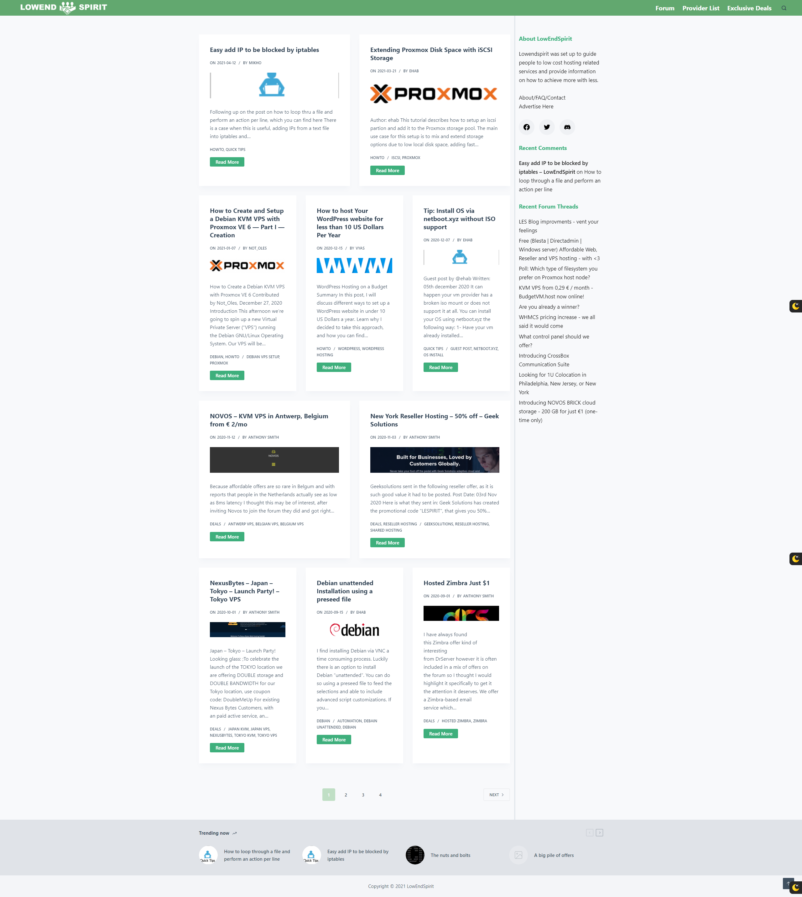
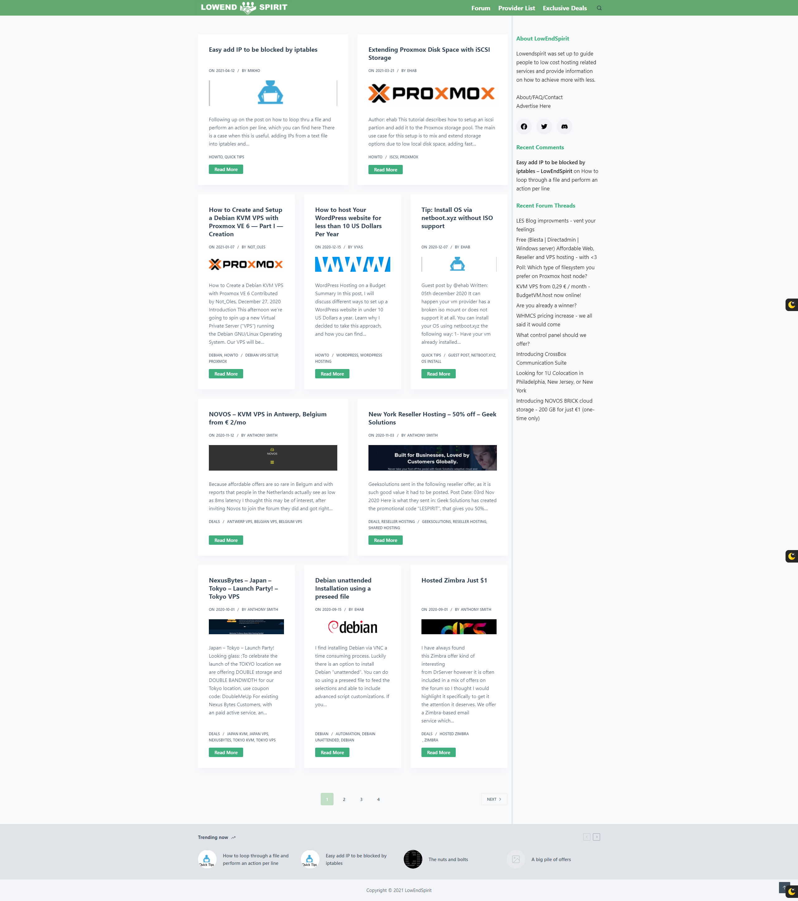
Here is another alternative where I've tried to match a couple of the early comments.

- less green in the sidebar
- not so high header
- working menu on mobile view
- smaller post images (featured image in WP) - less pixelated
- Not a LEB copy (I honestly must say that I haven't visited LEB since before I left LET, I need help on this)
- removing the "mobile view feeling" when browsing the web view.
Working on
- Spacing in the sidebar - Recent Forum threads & Recent Comments
- Screenshot better or worse then the current look?25 votes
- Better88.00%
- Worse8.00%
- Still shit, I volunteer to give constructive feedback on improvments4.00%
“Technology is best when it brings people together.” – Matt Mullenweg


Comments
Already looking better (in the screenshot)
The newer version looks better; but it makes no sense to me to have multiple columns for a blog format which only has one timeline. However, I would not be starting a riot over this.
What I hate to the point of having to keep the expletives in though are the animations. Again, it's a blog/news feed, not a corporate presentation with zero informational value where the marketing department pats itself on the back when it sees how nicely all of the meaningless buzzwords are moving all over the place; as such, it would be nice if it were possible to quickly scan the content without pointless distractions/delays. (Yes, I hate most of "modern" web design with passion.)
Now I'll just congratulate myself on my first post being harsh criticism, and I'll see myself out.
this is my vent. feel free to filter it out.
new blog is really nice in light theme.
however not sure if I'm the only one facing this:
usually when I hit this site I go straight to forums section. (talk.l******)
on predominantly mobile view , there's not much motivation to navigate to the blog. also vice versa.
the tutorials posted are nice, but people like me won't notice until specifically pointed to it. I prefer having access to tutorial on the forum instead.
that being said, lesblog articles format are more reader friendly.
maybe the placement of the menu can be unified on mobile (sometimes it's on the left or right), new discussion button placed prominently above the main forum to encourage new mobile posts, remove or relocated "Latest LES Blog Posts" button in mobile view, to improve visibility of the subsections in the menu.
and maybe when a new article is posted, some auto posting to forum (cross link) can be done.
I bench YABS 24/7/365 unless it's a leap year.
I am gonna let it all out!
The end is nigh.
That is all. Phew, that felt good.
♻ Amitz day is October 21.
♻ Join Nigh sect by adopting my avatar. Let us spread the joys of the end.
looks so much better already! and just to clarify I was not "hating" it before ;-)
now I'd suggest to try and align smaller things, like:
height of headlines and with that the start of text blocks,
also the position of the 'read more' button (tie it the bottom line),
make a sticky menu to have the nav available even if scrolled down,
adjust the nav bar content to the inner width.
examples:

before
after
(that's taken on a 21:9 widescreen, hence the huge margin left and right)
the about text in the sidebar seems a bit lost, maybe put a box around it.
also for the recent topics of forum threads the readability is quite poor. adjust the line-height or add some margin between each link to help with that.
I do like the boxed listing style, because timeline does not matter so much for tutorial style blogging. also the slight animation is a good choice to make is less static. keep on going!
I dislike the animation.
Night mode breaks the top bar link styling.

https://phpbackend.com/
I don't like the animations at all. Would rather have a page that doesn't squirm around on the screen.
Whenever there is something on the page that moves or opens after a delay, there is likely to be a configurable parameter that says how long the delay should be. Another way to think of that parameter is that it sets "how much of the user's time to we want to waste before showing them the whatever?".
Once you think of it that way, it becomes obvious that it disrespects the users to set the parameter to anything other than zero. That is, get rid of the animation and show the final state of the page immediately.
increased the spacing between the topics and added a soft line in between.
Also changed the Recent Comments a bit to make it easier to read and "connect" to the correct topic.
This is a tricky one as titles are not always the same length and will be cut off in different places which will make the start of the next line "floating".
Will have to take a closer look at this as it won't be easy to cover every alternative.
the same answer as above, this is also "floating" depending on the text in the card.
Fixed it for you.
There was a set max-width for the main site and at the same time, the navbar was set to "fill".
That is now fixed.
Working on this, It's this
--menu-item-padding: 0 calc(var(--menu-items-spacing, 25px) / 2);that gets messed up because nightmode thinks its a color instead of spacing.
“Technology is best when it brings people together.” – Matt Mullenweg
it could also mean that the page is using "Lazy Load", which means that it loads what is first visible on the visitor's screen with the intention to display it as fast as possible. To not waste the user's time.
when the user then browse or scrolls down the page, the next part is loaded, which is shown as a short animation.
“Technology is best when it brings people together.” – Matt Mullenweg
Key points that I got:
From the comments so far, this depends on the person reading
I’ve got comments of one column, and comments that more then one is ”new”.
Good idea on the menu, the image will be downscaled. On the TODO list, not a priority right now.
This gets a little complicated as this is a ready-made plugin.
No settings to change in the free version currently running.
Other night mode plugins are evaluated.
“Technology is best when it brings people together.” – Matt Mullenweg
thanks for having a look, considering the feedback and even changing things!
yeah, do tell me, I had to fix alignment wishes of designers a lot. probably easiest way would be to set line and min-height in em to make it depending on each other. for the wider boxes stick with two lines min height for smaller make it three. when creating articles try to make the headlines somewhat comparable in length, just no overly short or long ones and you should be good to go.
this is actually quite easy: as long as it is the last element in that box, you can use something like
margin: auto 0 0;on the button element, which adjust the top margin automatically and ties the element to the bottom...thanks again for your efforts!
Unless it does the opposite. Lazy loading and Fade-in effect is not the same thing.
When I scroll down, I want to see the content immediately, why I have to wait for 0.5 seconds to complete the animation? If it had anything to do with network latency, then I could (slightly) understand current implementation, But why burn my CPU cycles only to show already available data on multiple paint?
On another note, I would suggest using
loading="lazy"in img tag for fine lazy image loading support.https://phpbackend.com/
In the case of these animations, they are already loaded and then there is a small delay before they move into place, as if the page is still unfinished when the person starts looking at it. Anyway, lazy load is a sign that the page designer has put more effort into bling than into a performant backend. The total amount of bytes sent is usually quite large because of all the JS bloat. I suppose I'm being old fashioned, but stuff worked fine without all that cruft. I'd rather have a no nonsense site, reminiscent of craigslist topic pages if not exactly copied from them.
Some more changes made
Welcome to 2021:)
“Technology is best when it brings people together.” – Matt Mullenweg
Far more judge the appearance of a site as important when first visiting than those that don't. Attracting new members is best achieved by giving them a reason to stay longer.
Some don't mind, but, if I was visiting this site for the 1st time I wouldn't stay based on the 1st version of the new blog at least. It's better now though although still not great.
The time users spend on websites today to find what they are looking for is way less than what it used to be.
First impression and showing what they are interested in is a key ingredient, the question is therefore obvious.
What would attract your interest? As it is "still not great".
“Technology is best when it brings people together.” – Matt Mullenweg
For me, it's just about consistency. I want to see a site show me they care enough about the look to also care enough about the content. I look a lot at trends and focus. My previous comment reflects what I read. That is first impressions determine whether a first-time visitor will even stay long enough regardless of how good the content may be.
Appreciate there is little you can do about the images until more content comes in.
As always, personal opinion from an occasional uninvested visitor.
it is better mikho but i would solve it somehow the differnt heights of the content what creates a ¨problem¨in my eyes. I mean the content between the image of the blog and the read more button is different in all the sections so it is causing a not regular form of the blogs . I am not pretty sure how could be solved somehow but this is the main ¨problem¨in my eyes. I am not pretty sure if you use a specific plugin or is a bespoke solution . May be could give it a try to use this grid free plugin The Post Grid By RadiusTheme which is making more simetric grids .
I believe in good luck. Harder that I work ,luckier i get.
The change isn't mobile friendly. On landing page, I only see "about" in drop down menu at the top instead of "forum", "exclusive blog" and "account/ login etc."
The differences in height between the content in the cards are, most often, caused by the different lengths in the title/header.
If the title/header is wrapped into a second line, the rest of the text/image/button is "wrong", as the positions are relative to the content.
I am aware of this and it will be sorted eventually. It is hard to fix and therefore I have focused on the quick fixes to please as many readers as possible.
@Lee
The menu problems are being worked on. The dark mode issue is caused by the dark mode plugin not handling the padding correctly.
I'm reaching out to the dev of the plugin to get this solved (at least to have the same menu in the light and dark mode).
The next step is to make the header look similar on the blog and the forum.
If it's not solvable, a new dark mode alternative has to be found. Or removed
Another option (that I thought of now) is to have completely different headers. Most of the issues right now is because the look "almost" the same. If it was completely different, there wouldn't be this comparison.
I don't understand your comment, could you perhaps screenshot the issues you are seeing?
Final comment, as there are reports from multiple platforms, an issue tracker should be created as the same issues are reported from multiple users and it will be easier to report the current status.
“Technology is best when it brings people together.” – Matt Mullenweg
Nice, I like it, I can't vote for some reason though the button just does nothing, maybe a safari issue.
The only feedback is that I would push to get consistency on the header bar/menu as much as is practical.
https://inceptionhosting.com
Please do not use the PM system here for Inception Hosting support issues.
Two things: 1) load speed, 2) see #1.
If that is your concern, then I'm happy.
“Technology is best when it brings people together.” – Matt Mullenweg
I ran the Google Page Speed Insights test twice. The results were 96 and 87:
Hope this is helpful! Greetings from Mexico!
I hope everyone gets the servers they want!
>


Same here!
I hope everyone gets the servers they want!
@xowxenxirix @Not_Oles
Thanks for clarification, the theme allows for adjustments for three "sizes", computer, middle and mobile.
Guess I missed to change the mobile menu while changing the computer menu.
Will update shortly.
“Technology is best when it brings people together.” – Matt Mullenweg
Menu in Firefox on Desktop looks crammed:

@mikho when changing to dark theme it condenses the navigation menu. I tested the dark theme plugin on another WP install and it does the same thing. Might be worth letting the devs know.