

OG-LESbian - cause I miss the old look







Yellow LESbians!
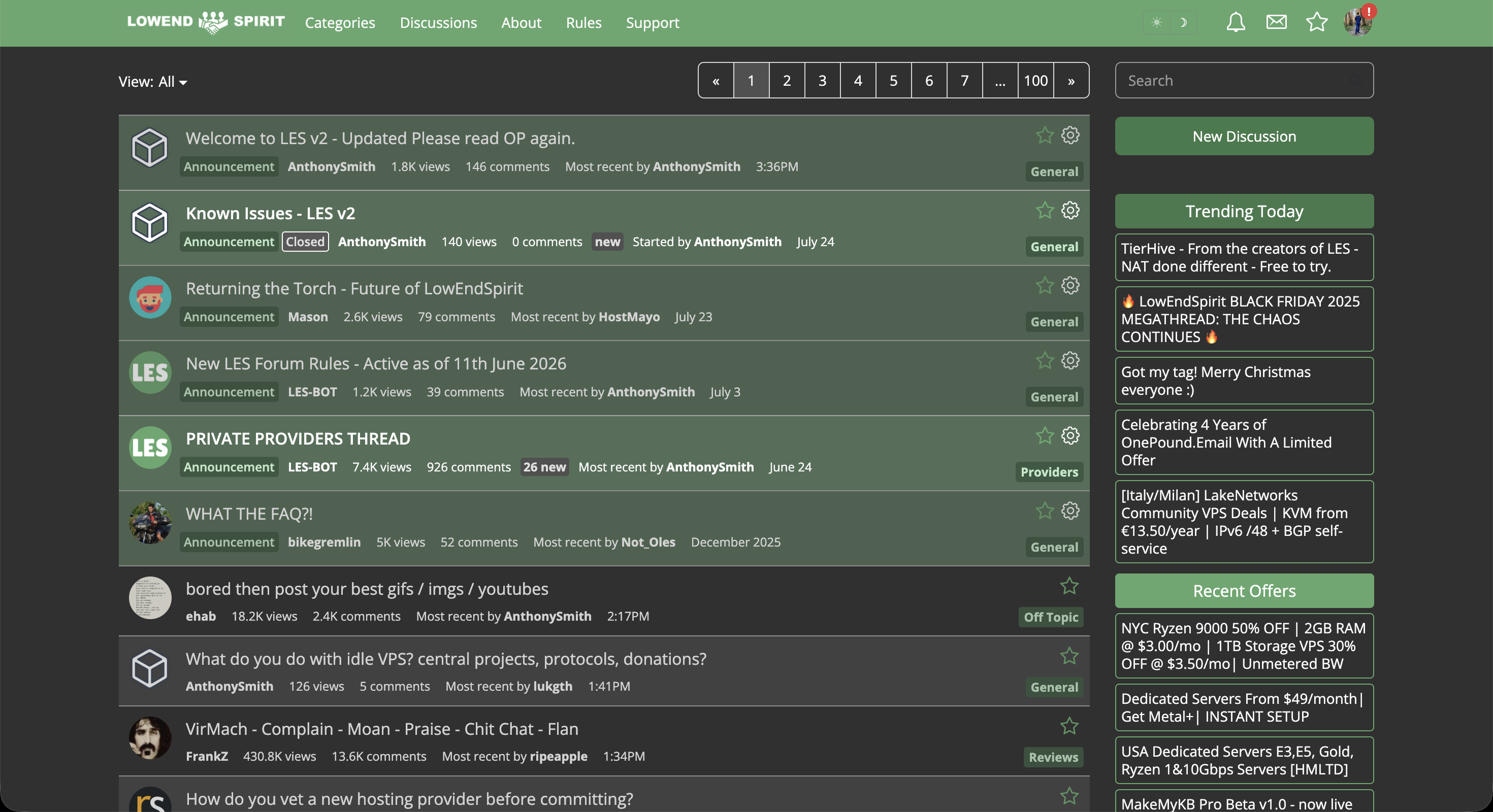
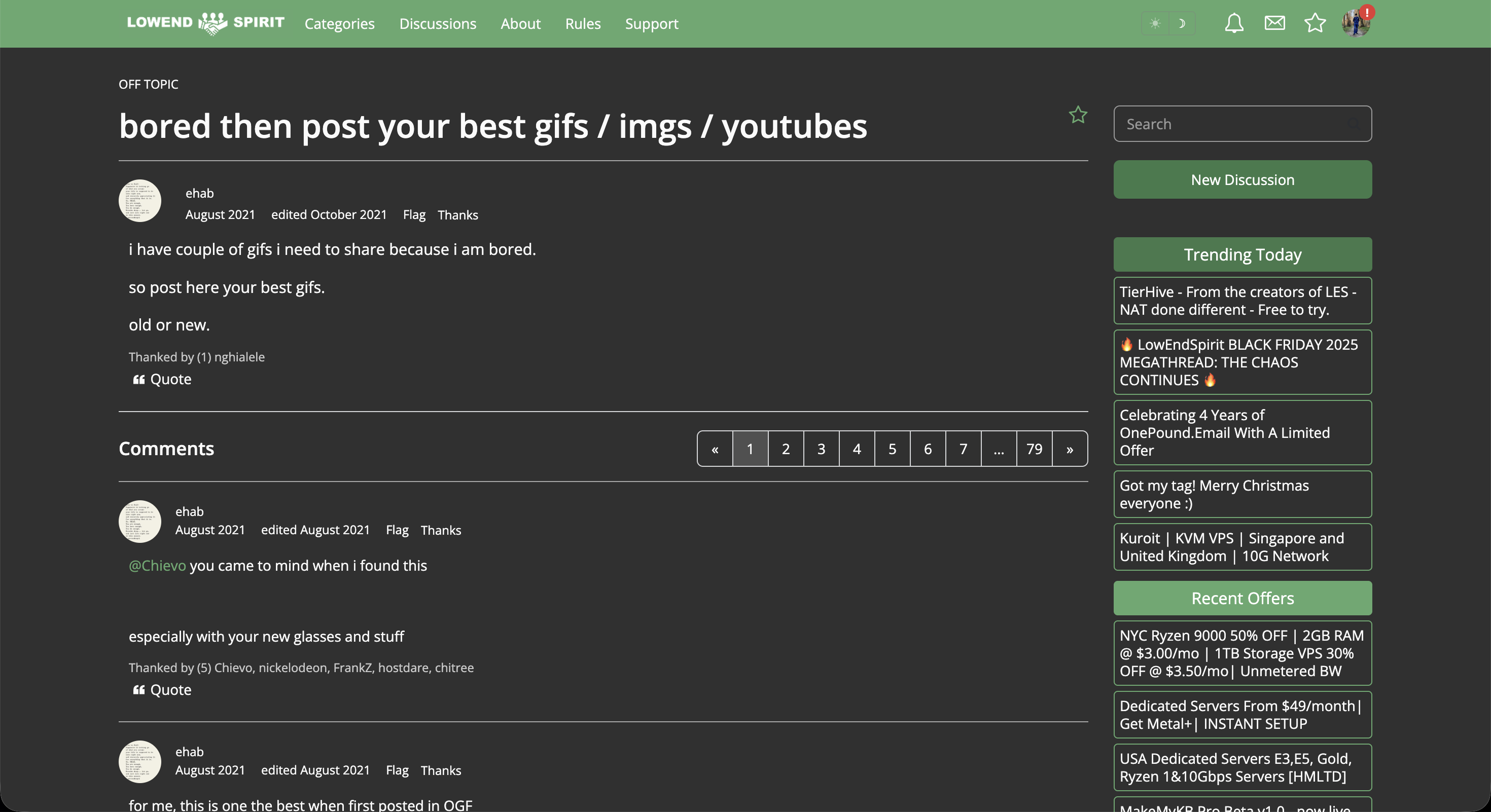
With the help of Claude I was able to bring back the old look of LES back from @AnthonySmith changes [sorry mate no hard feelings, just preferences lol].
This is purely CSS, no Javascript.
Here is a link to the github repo:
https://github.com/Rafal-Hacus/OG-LESbian
Installation:
1. Install Stylus - Chrome, Edge or Firefox.
2. Click Install OG-LESbian
3. Stylus opens its install page. Press Install style.
Only tested on a Macbook Air M5 13". Checked Chrome, and Firefox, though should work everywhere.
Screeenieeeessss:
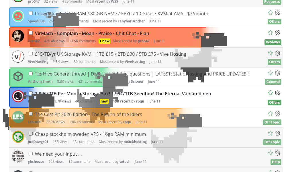
@AnthonySmith look:
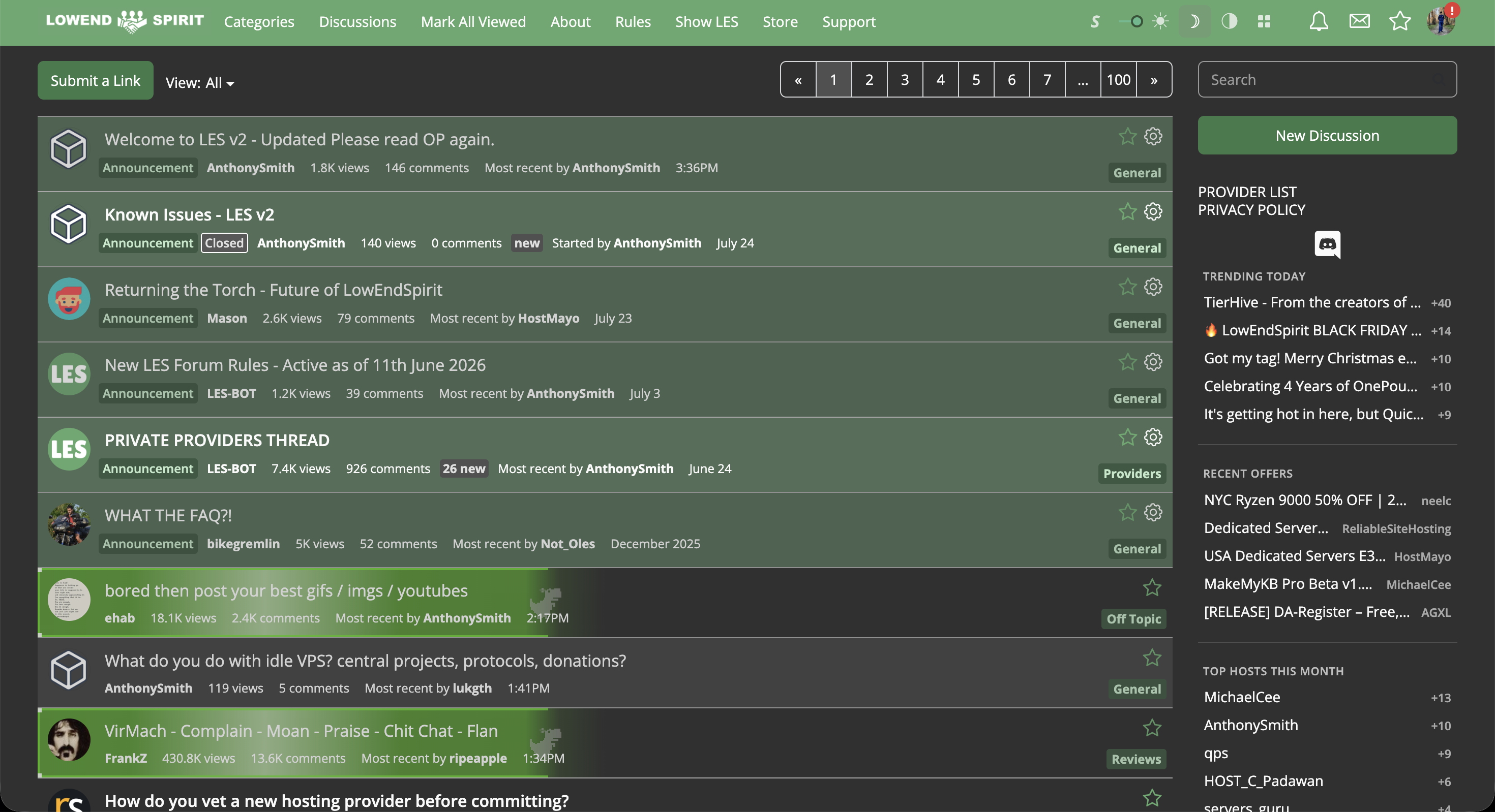
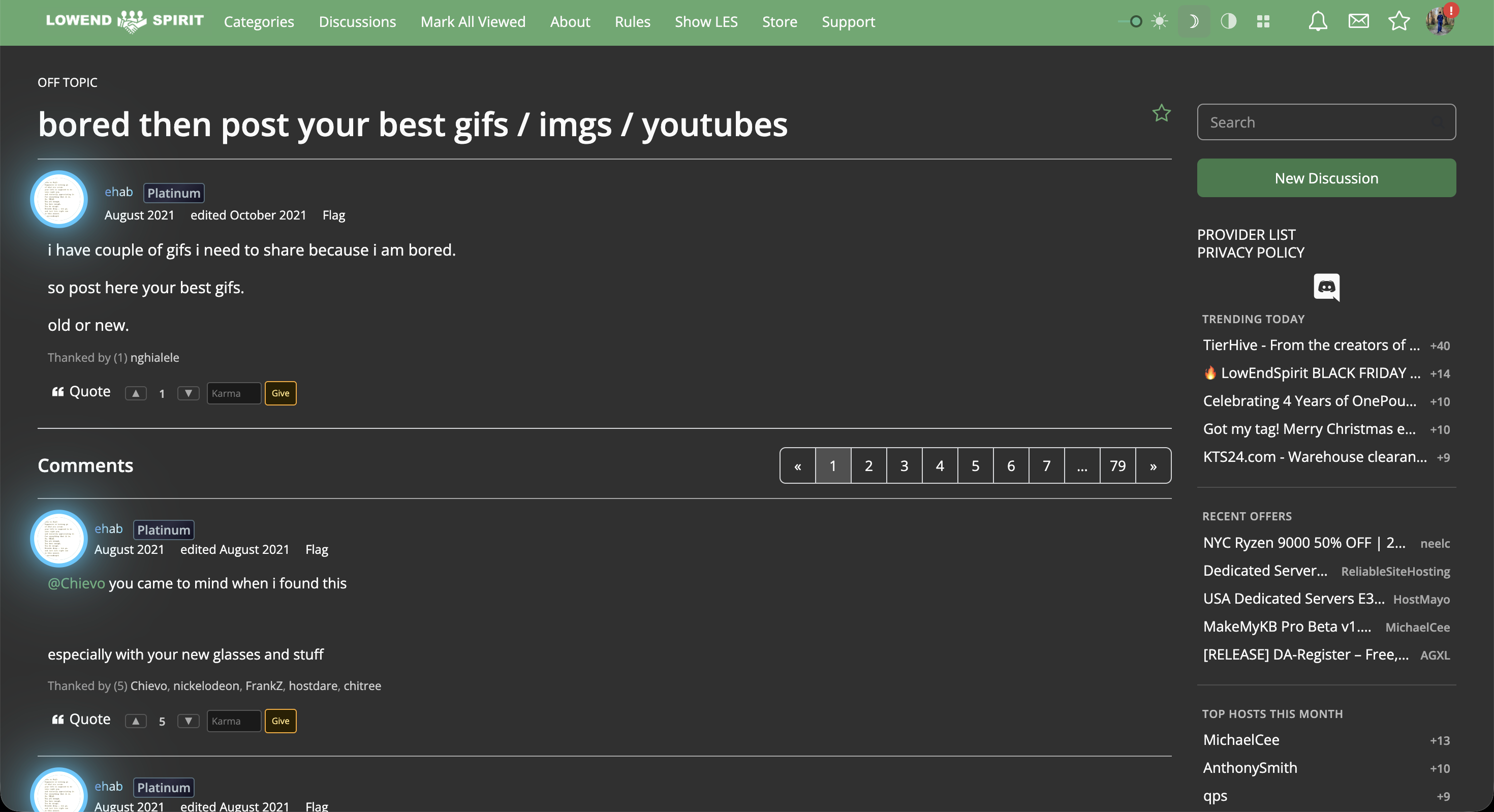
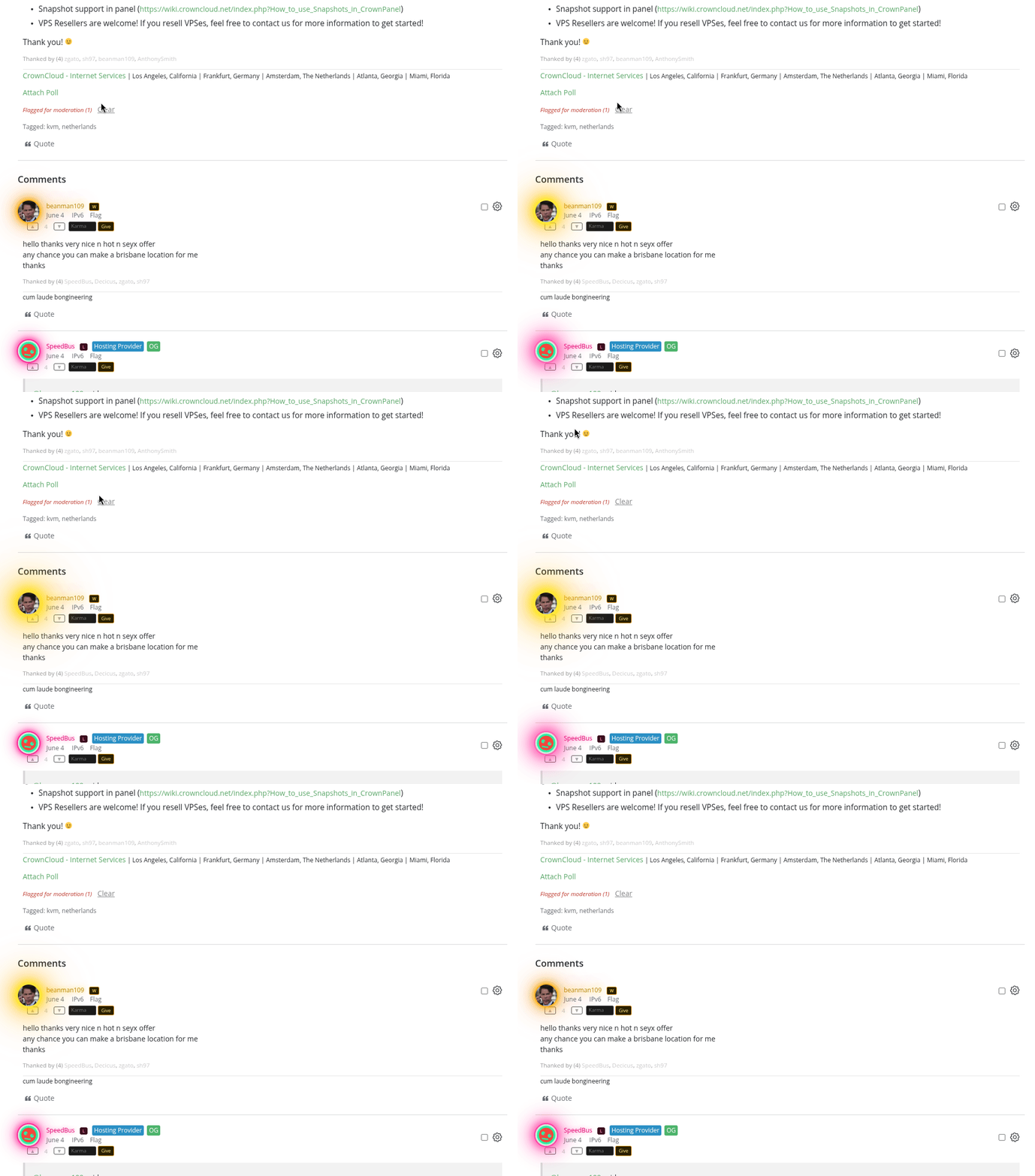
My CSS look:
Synteq Technical Support, Technical Writer.
Contact me at: +1 (307) 428 8111 or [email protected]
Comments
Noice
... not even 24 hours.
Just as a reminder: https://lowendspirit.com/discussion/11101/known-issues-les-v2
I wont go in to the theme changes that I already know need to be changed/reverted and the reasons for what you see now for the 87th time in a seperate thread.
You do you, I hope the changes on Monday/Tuesday don't ultimately waste your time.
TierHive - Hourly VPS - NAT Native - /24 per customer - DE, UK, SG, CA, USA x4, FR x2, AU, PL, NL, JP
FREE tokens on sign up, try before you buy. | Static Hosting Free for life: https://tierhive.com/static-hosting/
Alrighty, let's see how your update will look like, and if it's still not to the OG look standards that I have set for myself, then I'll update the CSS that will then be auto-pushed to everyone using this [if anyone other than me ends up using it, which is probs unlikely anyways lol]
Synteq Technical Support, Technical Writer.
Contact me at: +1 (307) 428 8111 or [email protected]
No worries, it won't be identical to the old standard, but almost identical; it will just be standard with slightly different widths and a tody top bar.
But some of the planned stuff uses the side bar in a very different way so I was just giving you a heads up, you may have made a rod for your own back as I am going to be constantly tweaksing the creap out of everything, nothing should break I guess, but you have a dedicated thread fr it now to support those that use it I guess
The real V2 is blue Basically the vBulletin dark with standard vanilla layout.
TierHive - Hourly VPS - NAT Native - /24 per customer - DE, UK, SG, CA, USA x4, FR x2, AU, PL, NL, JP
FREE tokens on sign up, try before you buy. | Static Hosting Free for life: https://tierhive.com/static-hosting/
Gotcha
I guess I do lol. And I also now have established Saves of the "OG" design with their old CSS/HTML, and everything else that will help me convey: I want it to look like that to claude lol
BLUE???? THAT'S BLASPHEMY! GREEN FOVEREERERERERERERER

Synteq Technical Support, Technical Writer.
Contact me at: +1 (307) 428 8111 or [email protected]
I mean... Why? Just move this slider all the way to the left.

This also changes the margins, which I have no clue why I care about so much, but eh that's just how my brain works lol.
Also badges go to /dev/null, never really liked them at discord, don't really love them here [just a pet peeve]
Moves the Thank button back to it's original place, which is just a QoL change for me
Yoinks the whole Karma system, which feels very nodeseek for me, and once again a pet peeve for me.
Synteq Technical Support, Technical Writer.
Contact me at: +1 (307) 428 8111 or [email protected]
Bit of change is good
Being able to turn off the bling is important though...that's the type of thing thats fund but gets old fast
So you actually like reading a long post an then scroll all the way back up, to give a thanks?
or not give one at all?
just curious
Meet Nix and Bruce @ https://twobirdsonelesbox.com
My project/stuff page @ https://serveraddict.net
I think the up/down buttons are the wrong way round: down should be on the left and up on the right.
I don't even know what is all this, why threads have progress bars? This thread is 40% done, and the other one is only 10% in. Hello.
It's more of: I've been on the OGF since December 2020, and it's muscle memory
And I also still lurk on the OGF, which just reinforces that
Synteq Technical Support, Technical Writer.
Contact me at: +1 (307) 428 8111 or [email protected]
I see the problem 🤐😇😉
OGF is the history, this is the future.
Meet Nix and Bruce @ https://twobirdsonelesbox.com
My project/stuff page @ https://serveraddict.net
A bit nitpicky - but still, I would disagree.
The order is just right and intuitive as it is.
🔧 BikeGremlin guides & resources
I suppose we're learning, I like the path this theme stuff is going towards.
I'm unsure about what buttons I pressed on my theme section, but I now have a very nice grayish background rather than the plain white one, or the dark one, I do prefer this.
datalix's aff #1 fan
Maybe I will just make it a profile option then you can have up down or down up
TierHive - Hourly VPS - NAT Native - /24 per customer - DE, UK, SG, CA, USA x4, FR x2, AU, PL, NL, JP
FREE tokens on sign up, try before you buy. | Static Hosting Free for life: https://tierhive.com/static-hosting/
This new design is well and truly absolutely atrocious. There needs to be laws and international treaties that prevent something like this. I did not know the human mind was capable of design this outrageously absent of sensibility.
I keep thinking it's so bad it can only be intentionally bad. A joke of some sort. A delayed or premature April fools.
There was nothing so wrong with the old design that it necessitated this abomination be forced upon the users. Continuous, iterative enhancements would have sufficed for years to come. If that seemed like a boring task for the designer/developer, maybe a side project would've been a better outlet for creativity.
Anyway, I'm barely more than a lurker so my opinion is irrelevant.
Where is that meme.... Stand by, brb
TierHive - Hourly VPS - NAT Native - /24 per customer - DE, UK, SG, CA, USA x4, FR x2, AU, PL, NL, JP
FREE tokens on sign up, try before you buy. | Static Hosting Free for life: https://tierhive.com/static-hosting/
I can't find it, this classic combo will do.
TierHive - Hourly VPS - NAT Native - /24 per customer - DE, UK, SG, CA, USA x4, FR x2, AU, PL, NL, JP
FREE tokens on sign up, try before you buy. | Static Hosting Free for life: https://tierhive.com/static-hosting/
and yet you said it !!!
Anthony has worked really hard for the benefit of the community and deserves many thanks and support. He admits it is not perfect, he knows what people dislike and he is working to fix the problems. All of that for no monetary reward. Without change nothing happens so give the guy a break and learn to support others.
Get your FREE VPS if you develop Open Source software
Maybe he is complaining about the remake from the OP? Hard to tell, either way my meme applies
TierHive - Hourly VPS - NAT Native - /24 per customer - DE, UK, SG, CA, USA x4, FR x2, AU, PL, NL, JP
FREE tokens on sign up, try before you buy. | Static Hosting Free for life: https://tierhive.com/static-hosting/
He probably hadn't bothered to read anything so he's still got the slider at maximum flair ( which I think we all agree was fairly bright ).
Yeah that's probably it.
TierHive - Hourly VPS - NAT Native - /24 per customer - DE, UK, SG, CA, USA x4, FR x2, AU, PL, NL, JP
FREE tokens on sign up, try before you buy. | Static Hosting Free for life: https://tierhive.com/static-hosting/
I am using the website the way it was presented to me, except I think I changed from Grey to Light theme. I haven't read through all the threads and posts, largely because reading has become so much more difficult now with all the visual distractions.
You should absolutely blame users for being annoyed when you make changes to your website. Furthermore, you should definitely expect users to read through several threads before sharing their opinion on how a once-familiar website is looking after a major design and features overhaul. This one is on me. 100%.
If the slider is supposed to do something, I can report that until just now, it wasn't working or doing anything for me. Might've been a bug or my browser interfering with the script. Anyway, I tried it again now and it works. Very nice, thanks for that!
In all seriousness @Dupondt I know I messed it up, but, the function is more important than the form for a few days.
Work starts tomorrow.
TierHive - Hourly VPS - NAT Native - /24 per customer - DE, UK, SG, CA, USA x4, FR x2, AU, PL, NL, JP
FREE tokens on sign up, try before you buy. | Static Hosting Free for life: https://tierhive.com/static-hosting/
No, no, no ... not 100% - but some, yeah. This has been discussed for months, was announced as happening two weeks ago, and a couple threads created to discuss the aftermath of what we liked / didn't like. In there was discussed the slider bar. So you had foreknowledge that things would change and might require some adaptation. Even if you skipped the discussions just taking a moment to look at the screen to see what's different and perhaps explore "What's this thing?" before immediately shitting all over Ant's work would've probably saved you some grief. As some have said, Ant put a lot of time into this and you flew right to denigrating it. Getting a little mild shit over it seems reasonable. But that's just my $0.02.
It's actually a 5 weeks ago
https://lowendspirit.com/discussion/10979/les-progress-update-19th-june-2026/p1
June 25
https://lowendspirit.com/discussion/11004/les-platform-updates-28th-june-2026/p1
But, the original discussion happened almost 3 months ago. VirMach also participates
https://lowendspirit.com/discussion/10844/hello-again-les-things-are-probably-going-to-change-a-bit-here-are-my-ideas-i-want-your-input/p4
It's racist that I don't get the glow circle avatar.. so I want to go back to the OG theme :'(
Chicken.
And I, for one, welcome our new insect overlords.
I'll own that I was too abrasive in the phrasing of my criticism. But I would like to push back a bit on the foreknowledge aspect.
Maybe I'm just a wacky edge case, but I check in on LES a few times a week, usually briefly. Sometimes weeks or months go by without checking in. I read threads and post very little. LES is a valuable source for tech trends, news/happenings, and learning about new things. I've heard about tools and services here that have been truly useful, and I have or have had servers/domains with probably dozens of providers here.
However, I don't read every thread, especially very long ones with multiple pages. That's just the kind of horrible lurker I am. Part of the reason is the tolerance for off-topic posts here. Threads get derailed and you don't know if the remaining many pages actually contain anything useful. I'm practically never going to sit through 10+ pages of in-jokes and memes that aren't addressing the original topic. (I am accepting my fate of having become a grumpy fun-hating troglodyte.)
So when I opened LES first and saw the new design, I figured some browser plugin like NoScript or uBlock Origin must be messing with the CSS and just closed it. That happens a lot. Or that I missed an in-joke. Then I came back and saw it was intentional. I tried going about my usual readings and just couldn't because it looked like Geocities 1997.
TL;DR - I think expecting foreknowledge from casual lurkers might be a lot to ask. But also, I'm at fault.